We made our way to Clerkenwell Design Week this week to catch up on the latest interiors and furniture trends, many of which are still hot from the Milan furniture fair in April – arguably the biggest event in the interiors calendar.
We made our way to Clerkenwell Design Week this week to catch up on the latest interiors and furniture trends, many of which are still hot from the Milan furniture fair in April – arguably the biggest event in the interiors calendar. Some of the major brands were present, including Gubi, Gervasoni and SCP, alongside smaller design studios and individual designer-makers such as Eleanor Pritchard and Pinch. Below we’ve distilled our findings from the show into key colour trends for the season. You might be able to notice within this that retro silhouettes are still going strong as a trend – we saw a host of sofas, dressing tables and lamps referencing the 50s, 60s and 70s. We’re also delighted to report that our shutters can help you fulfil the trends we saw should you wish!
Pinks as a neutral
Pink is still going very strong with all sorts of shades of blush, nudes and corals present in a variety of forms. We saw sofas, cushions, printed fabrics,rugs, you name it. Don’t be fooled into thinking this is for ladies only – pair pink with a strong silhouette and suddenly you’ve got a thoroughly modern, gender-neutral shade!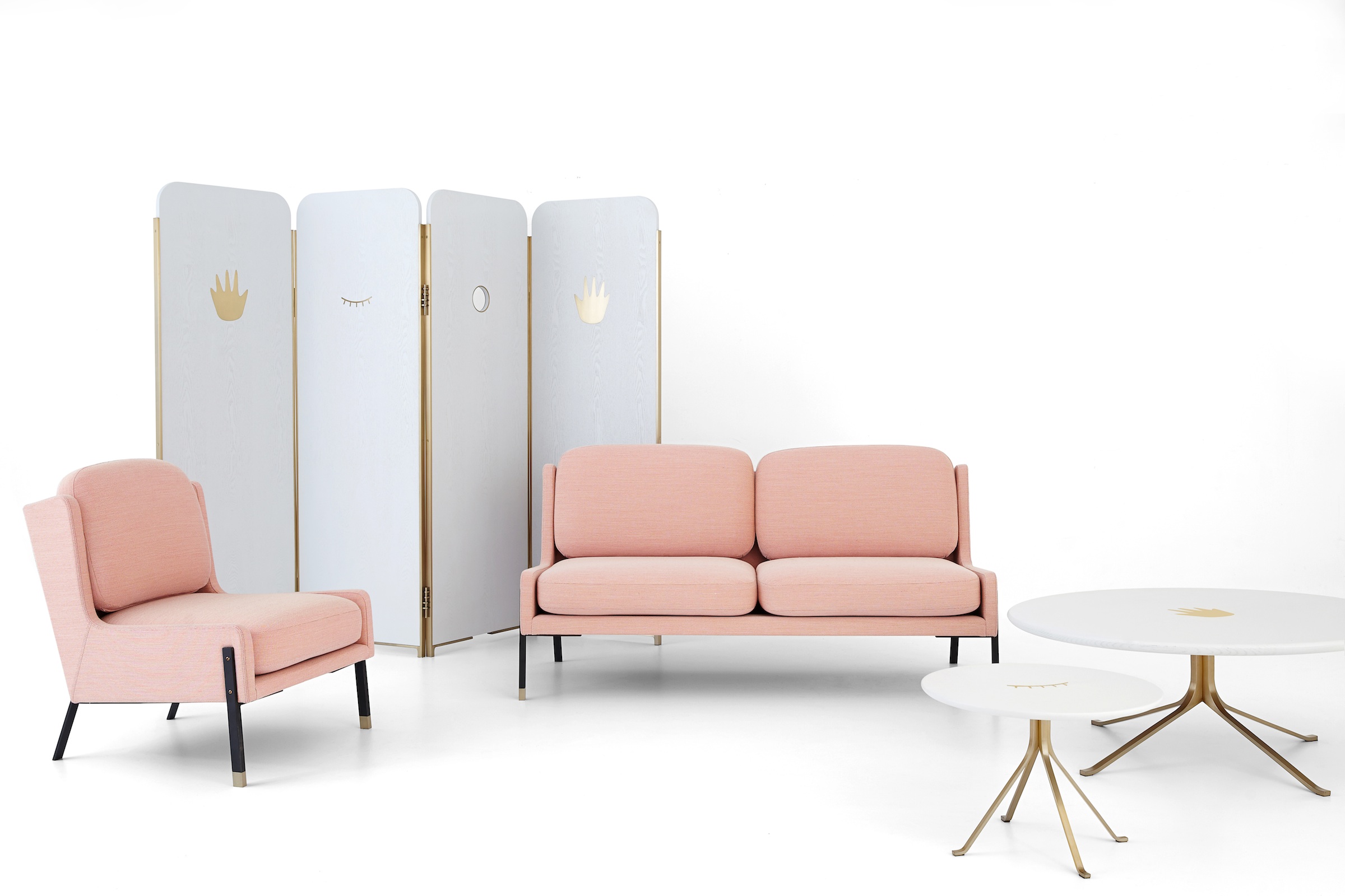
As you can see, pink works beautifully with warm metals such as brass, almost any wood and a variety of contrasting tones including plum and green, leading beautifully into our next trend…
Colourful Accents Part I: Green
As demonstrated beautifully by Pinch’s cabinet above, green tones especially well with natural woods, but it was also used in contrast with pink (as mentioned) and warmer burnt oranges as well as all sorts of browns. We saw all the greens out in force – forest, moss, emerald, olive and sage.
Colourful Accents Part II: Hot tones
Coral, orange, red – all the hottest colours were used as accent tone in various ways. What does this mean? The hot colour was not necessarily the main event, but more of a detailed colour – think upholstery, furniture frames, lights. If you’re going for red make sure you really love it as it has a huge presence even when used minimally! That said it’s one of the best ways of adding a graphic element to your home.
Brown with blue
Maybe it’s the influence of fashion, where the 70s is having a big moment, but brown was everywhere – often used as a base tone for a collection, often in the form of natural wood or materials such as linen. But more prevalent than ever was that brown is a great colour partner for blue. With its classic roots, this is a great contrast to work in the home whether you love traditional or contemporary design.