Or should we say colours! In a twist, this year’s ‘colour of the year’ is actually two complimenting colours.
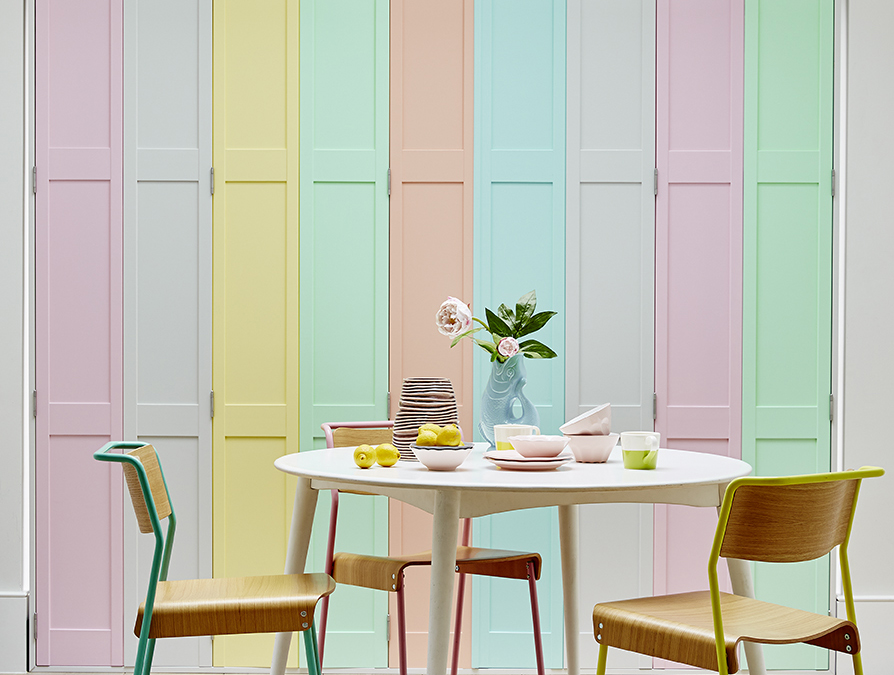
Here at Shutterly Fabulous, much like the rest of the design world, we eagerly await the release of the Pantone Colour of the Year. This year, for the first time ever, the colour giant revealed two separate shades as complimenting dual colours of the year. Rose Quartz a gentle pink, and Serenity a pastel blue. This is obviously of great delight to us at Shutterly, as our 2015 was all about pastel colours and gentle shades.
What do the experts think
Leatrice Eiseman, the executive director of the Pantone Institute, states “Joined together, Rose Quartz and Serenity demonstrate an inherent balance between a warmer embracing rose tone and the cooler tranquil blue, reflecting connection and wellness as well as a soothing sense of order and peace.”
In terms of our shutters, pastels are very much still in and we love to see the amazing designs you make. Our custom colour service allows our customers to match the new Pantone colours, or any shade to perfectly suit their room. Contact the office on 0808 250 3826 for more information on our service or to book a free no-obligation home appointment from one of our consultants.