


Choosing the right shutter colours can be tricky. Between more popular neutral colours like white and grey and more daring bold colours, you’d be forgiven for scratching your head. Well, that’s what we’re here for. In this blog, we’ll give you the lowdown on how to achieve the perfect look for your home.
When considering shutter colour options, there are two things you should consider: personal taste (that’s a biggie) and which part of the room you’re looking to complement. Plantation shutters can be used to blend and merge with existing features or to stand out and create a statement piece. Shutterly Fabulous offers a wide range of colour options, including our unrivalled custom colour service. But more on that shortly.
A space to fall in love with again and again
Why is white such a popular colour for shutters? It’s because white coordinates well with virtually any interior décor style. Not only does white open a space for a clean and fresh look, but it also provides the perfect base palette for all your seasonal transformations.
If you’re after a crisp, contemporary look, bright whites like Vivid White and Traffic White are your winners. However, going with a subtle warmer tone such as Cream or Cream Grey exudes a more traditional feel.
When choosing your shutter colours, remember to match to your soft furnishings as well as your window frames and sills. Matching to these elements creates a seamless and uniform effect in your interiors.

The growing trend of using greys has been sweeping our homes in the last few years, and interior shutters are no exception. As a balanced, practical colour, grey shutters will give your home a more conservative and sophisticated look. A cool grey like Cream Grey brings a sense of calm to proceedings, whereas a darker shade like Traffic Grey or Signal Grey communicates strength and assuredness.
Plantation shutters: The perfect focal point
Colourful plantation shutters make a fantastic alternative to a feature wall, becoming the focal point to any room. Unlike a feature wall, shutters also give you control over how much natural light you let in, allowing you to control the ambience from dusk till dawn.
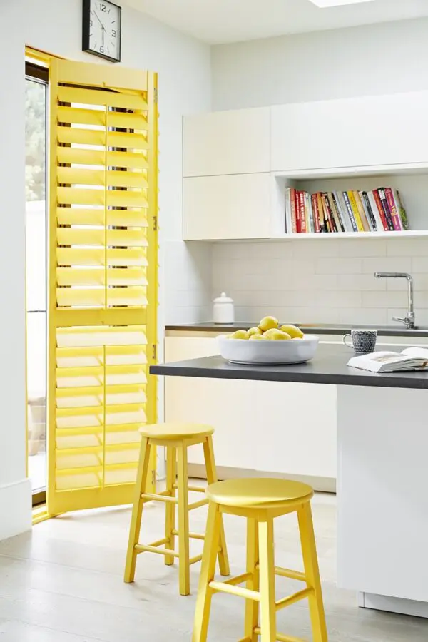
Colour blocks are growing increasingly popular too, injecting bursts of bright and bold shades for playful pops of colour. Why not combine fruity lemon and papaya with geometric patterns for a fresh, awakening hit of colour? Plus, you’ll bag plenty of character and vibrancy in the process.
Shutterly Tip: Choosing the right yellow will induce high-spirited energy and boost productivity – perfect for a home office.
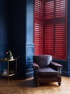
Dark mood and tonal ambience
Dark, moody tones are back, and they’re ideal for creating a cosy space for those cosy nights in. At Shutterly Fabulous we love a deep crimson shutter. It’s a great way to bring a touch of class to a bedroom or living room.
Dark shutters also help absorb the natural light, making small rooms appear larger than they are.
Choosing a dark shutter palette acts as its own décor too, so there’s little need for interior change when you’ve made a statement as bold as this one.
Shutterly Tip: Keep your interiors looking crisp and clean by alternating dark and light colours that balance the room’s natural and artificial lighting.
Embrace the Trends
The world of interiors is all about reflecting your personal style, but staying on top of trends can be a great way to add a touch of modern flair to your home. Some of the hottest colours of 2024 are set to continue their reign well into 2025. Here’s how you can incorporate these trends into your home with the perfect plantation shutters:
Warm and Inviting Cocoa: Coco brown is a beautiful and versatile colour that’s anything but boring. This rich shade exudes a sense of luxury and sophistication, making it perfect for creating a cosy and inviting atmosphere.
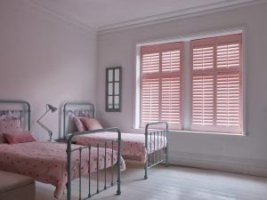
Peacefully Serene Peach Fuzz: If you’re looking to create a calming and nurturing environment, look no further than Peach Fuzz, the Pantone Colour of the Year 2024. This soft and delicate shade is a nurturing and mind-enriching colour, making it a perfect choice for bedrooms or bathrooms.
Bliss with Beautiful Blues: There’s a reason why blue is a timeless classic. Blissful blues continue to be a major trend in 2024 and beyond, and for good reason. This calming colour creates a sense of peace and tranquillity in any space, and pairs perfectly with a variety of hues, including sunset tones.
No matter what your style is, there’s a colour trend out there for you. And don’t worry if you’re more of a summer person, because there are plenty of summer colour trends for you to get on board with too. And with our custom colour match service offering hundreds of hues, you can find the ideal shade to create Shutterly Fabulous shutters that are uniquely you!
A feast of colours to choose from
Whichever colour route you go down, always keep in mind what kind of mood you’re looking to create. Shutters are a practical and long-lasting solution to your window dressing, so be sure to allow yourself the flexibility for your home.
At Shutterly Fabulous, we colour match to any Farrow & Ball, Dulux Trade and Little Greene Paint. So, if you have a perfect shutter colour in mind that’s not on our charts, simply speak to a fabulous member of our team or book a free in-home appointment with a Shutter Specialist and start transforming your home today!