


At Shutterly we have a collection of core colours that you can choose from as well as a custom colour service that allows you to specify something for us to colour match. It’s always interesting to see what you go for and we also like to keep an eye on colour trends as they emerge on the interiors landscape.
At Shutterly we have a collection of core colours that you can choose from as well as a custom colour service that allows you to specify something for us to colour match. It’s always interesting to see what you go for and we also like to keep an eye on colour trends as they emerge on the interiors landscape. Often, it’s colour combinations that turn our heads most so on that note, here are a few of our favourite ideas.
Shades of blush
Dulux’s colour of 2015 is Copper Blush and my it’s a beauty. It looks wonderful with the darker coral shade used beneath the shelf in this room. A stunning, warm combination.
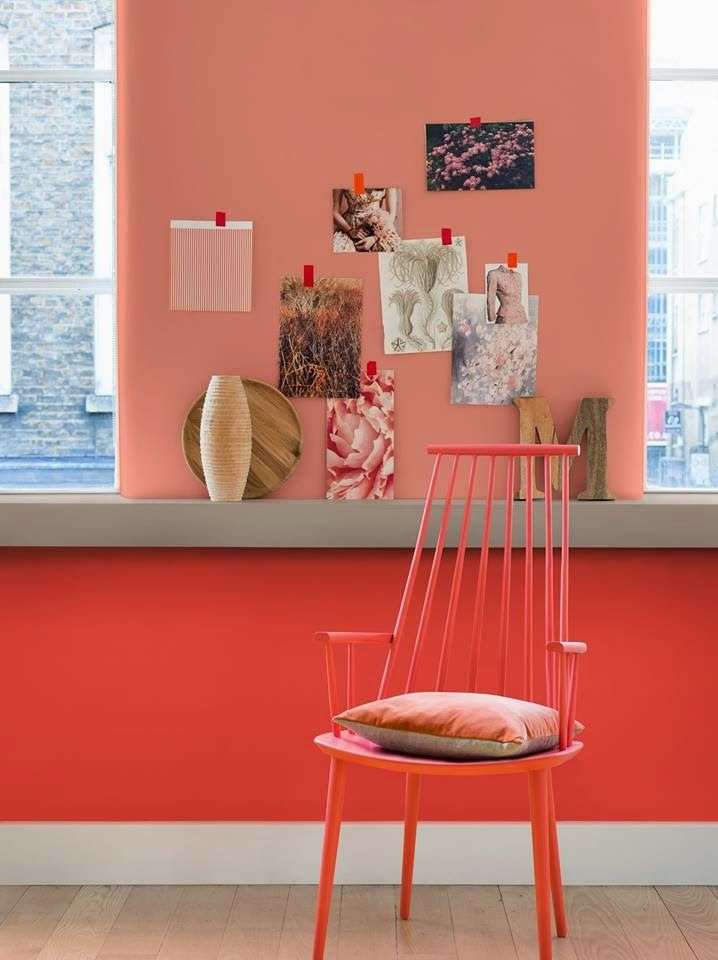
Image from Dulux
Colour-blocking primary shades
We love the use of three colours here, but if it were our house we’d want the shutters in the same colour as the skirting boards. Swathing such a vast area in yellow is not for wimps of course, but statement-making it is. Perfect for colour-lovers.
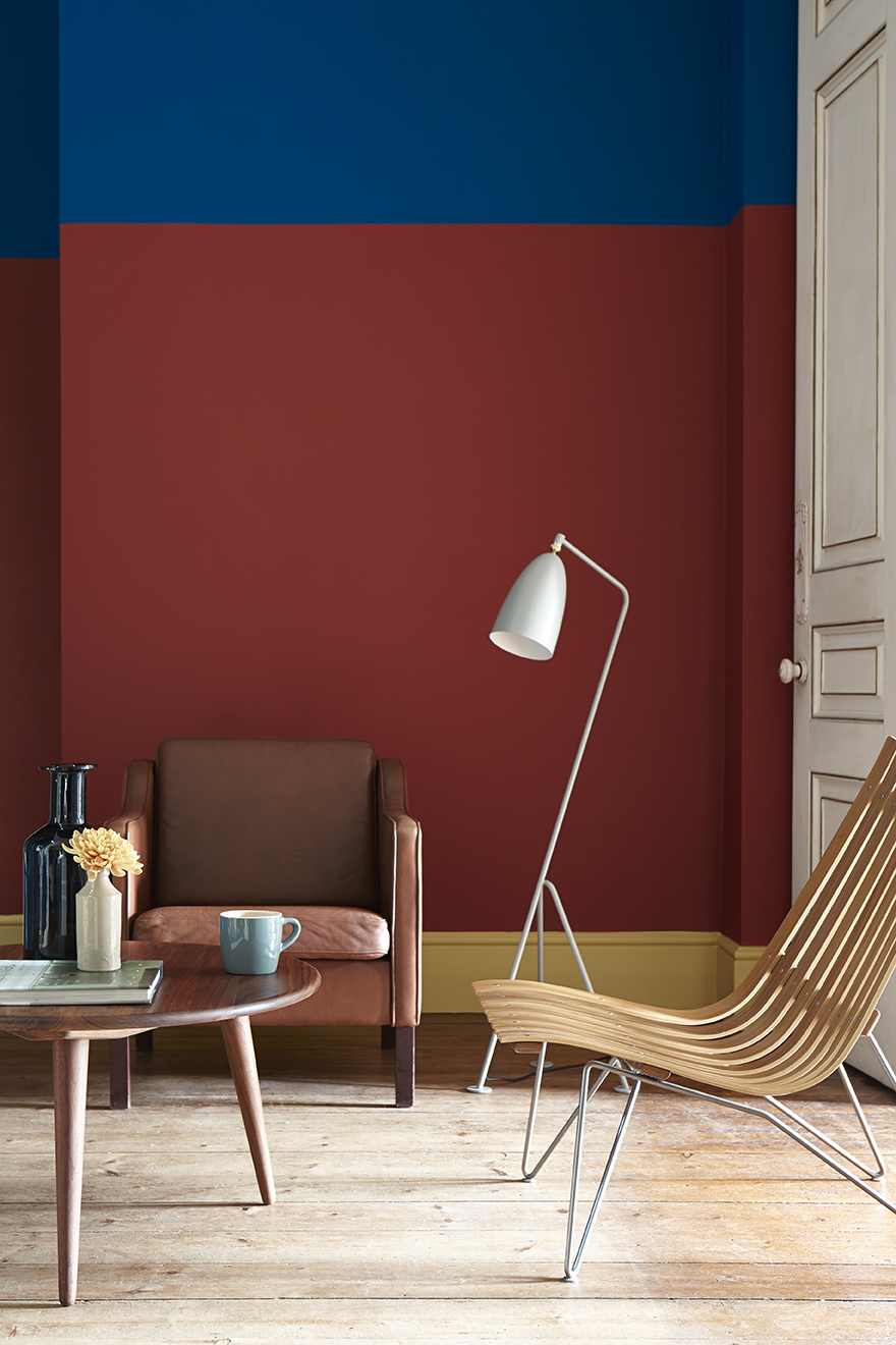
Image from Little Greene
Blending blues
Blue has been a trend story for quite some time and looks set to keep on going. In this scheme, the walls are split into two blues, with the darker shade used on the woodwork – ie the skirting board and dado rail. It would make sense to continue the theme to the woodwork of your shutters too, picking them out in the darker shade rather than lighter. Alternatively, try a few different blues on your shutters too, in a bid to continue the colour-blocking theme (see our blues together here). Finally, the hit of tomato red from the lamp is a nice added touch in this room and stops it from feeling too samey.
Image from Little Greene
Hot pink as an accent tone
We love neon pink shutters (evidenced by our Pinterest page) so it’s easy to imagine them in this kind of dark interior. It’s actually painted in the mossy Invisible Green colour by Little Greene, but you could also try pink with grey, black or navy blue to achieve similar results. It’s all about the down with the up. For lots more colour combination ideas visit our specially-made Pinterest Board and let us know your favourites.
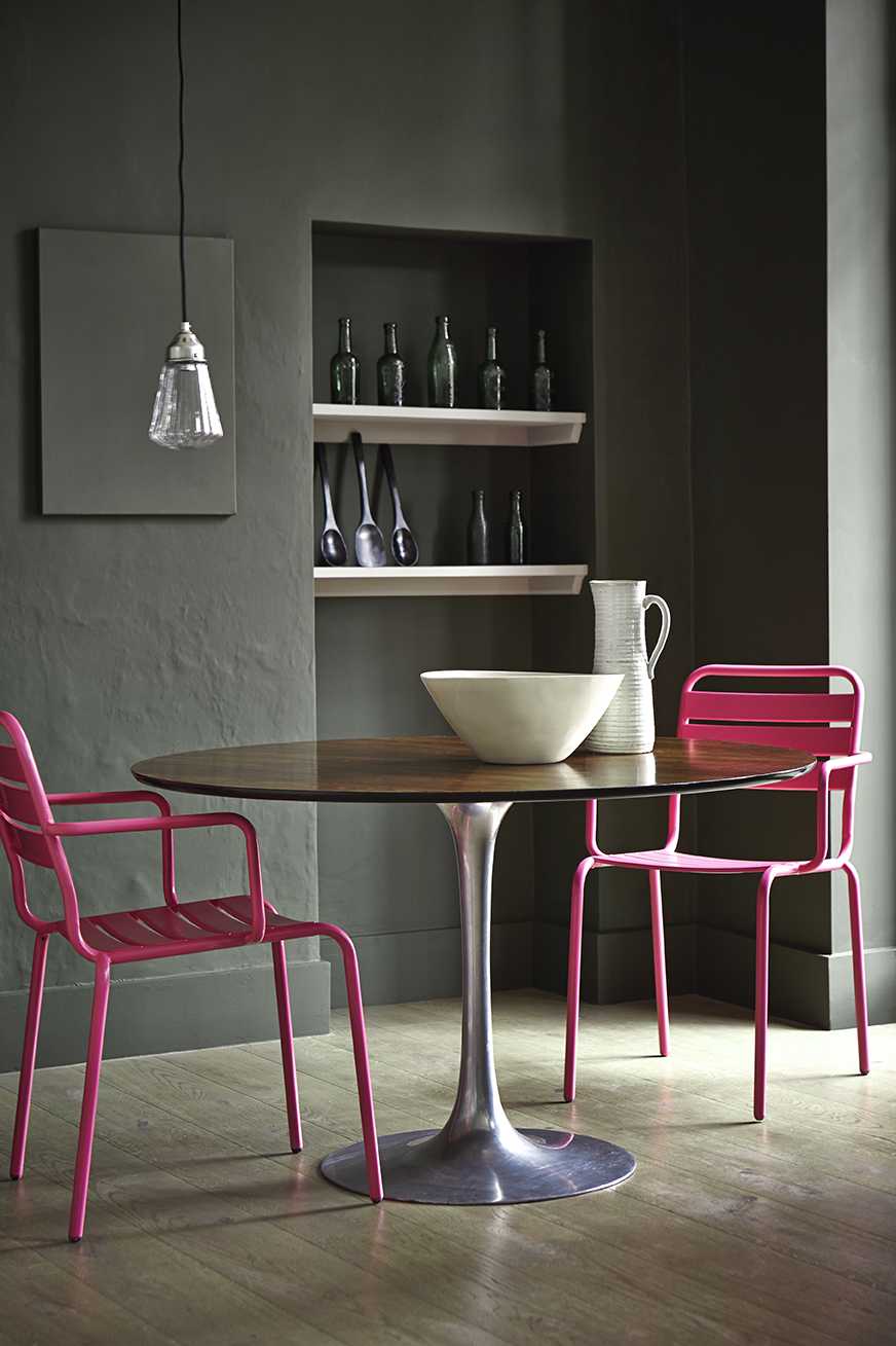 Image from Little Greene.